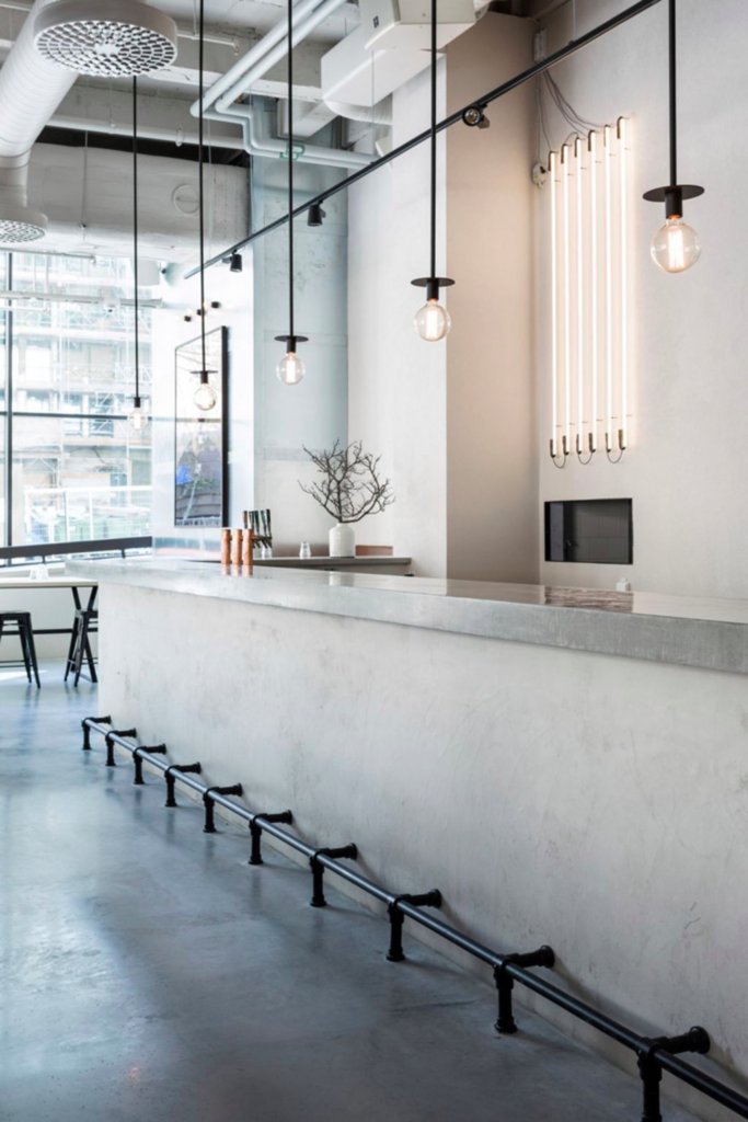
We are all familiar with the minimalist design trend that has been gaining popularity in recent years as a response to increasingly cluttered and materialistic modern life. Minimalism is often summarised with the phrase “less is more”, as the design premise is to furnish a room using fewer items that are more carefully chosen for the impact they create. The overall impact of the room design should create a feeling of calm and balance.
This idea of creating a space of calm in chaotic and cluttered world can be extended to commercial spaces as well, specifically to cafes and restaurants. By using minimalist design, diners are provided with a peaceful space, or retreat of sorts, where they can take pause to enjoy a meal.
You can easily incorporate minimalist design trends in your own restaurant or cafe space.
Once you have outfitted your restaurant with simple and elegant kitchen equipment, such as those found at Butler Equipment, you can turn your restaurant into a minimalist dream with a few simple tips.
Start with a neutral base.
The first step to any minimalist room design is to start with a neutral base.
With minimalism, colour is understated, meaning you generally stick to whites with occasional blacks and neutral browns, blues or greens. Most people go with white walls, either in a warm or cool tone, depending on the overall effect you want to create. You don’t want color to overwhelm your space, rather it should enhance and illuminate the rest of the room.

Maximise light.
The white walls found in most minimalist spaces serve to enhance natural light.
This brightens the room in a subtle way which adds to the overall calming feeling. Using high ceilings and plenty of windows also maximises the light in your space. The combination of a clean minimalist space and natural light gives the inviting feeling of a home kitchen, which makes your customers feel at home in your restaurant.
Related: 17 stunning restaurant designs
Use thin black lines.
Adding thin black accent lines through the use of carefully selected furnishings is a way to make colour pop without using actual colours. This works really well with things like light fixtures, chairs or to disguise industrial type pipes if you have an exposed ceiling. Black accent lines create a stark contrast with white walls and the otherwise bright space.

Add a pop of texture.
Rather than using color to add dimension to a room, with minimalist design you use texture. Stick to whatever neutral tones you have chosen for your space, but switch up the textures you use. For example, if you are using brown, you can use wood in the same tone to add texture. If you are using grey tones, you might use both metal and knit textures. This allows the space to be more tactile while still retaining balance and simplicity.
Leave surfaces uncluttered.
The most challenging, yet essential, property of minimalism is streamline the space by eliminating clutter down to the functional essentials. Many people go into the minimalism trend only to find they revert back to clutter. In the restaurant space, the decluttering principle can be applied through table decoration. Leave surfaces completely bare or set with just a single essential and functional centerpiece such as salt and pepper shakers.
Minimalist design in the restaurant space allows the diner to be centered in their dining experience, maximising on calming atmosphere and the food being served. By minimizing color and clutter you are able to create a more fluid environment, using less to reveal more aspects of what remains: great food.
You might also enjoy: Do you know what your customers are saying about you?


